Getting the opportunity to work on a project from start to finish is one of the most satisfying aspects of my job working in the creative studio of a marketing agency, particularly when it involves working with a new brand or developing an existing one. However, due to the nature of the game, this isn't always possible. Picking up a project that has already been worked on by another Art Director creates unique challenges, but it can also be extremely rewarding.
I was recently asked to work on the Immrama project, which another of our Art Directors – Shane O’Driscoll - had already begun. In his spare time, Shane is an artist who frequently pops back to his hometown of Cork to screen print pure, exuberant planes, cut through with snippets of his own photography. He has an eye for colour, let’s just say.
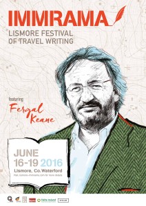
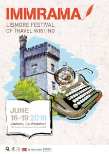
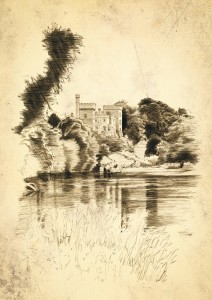
By the time I took over the project he had already worked with Epsilon’s studio artist John Donohoe to create two Immrama posters, one featuring Lismore castle and the other featuring a drawing of speaker Fergal Keane. He’d created a distinctive style of montaged photography layered up with John’s elegant sketches, then went over it again with swashes of paint. There was a map of the area in the background, a whirl of sky, Lismore’s famous castle, a typewriter, and a compass.
Shane had created a place that made me want to pack my bags and run off to immediately, which is exactly what a travel writer’s festival should arouse. As for the colours: beige (Pantone ref: Very Expensive Paint Named After Protected Species’ Indeterminate Body Part beige), cerulean blue, muted greens and earth tones, and finally a few sweeps of orange and black. I sharpened a pencil, laid out Shane’s work on my desk, and sat brooding for a day (and a half).
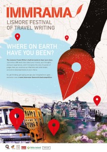
My brief was to create a microsite for the Transition Year Student Competition that was in-keeping with the style and brand Shane had created. It seemed the best idea after several scrunched up ideas was to work with the map background and introduce the red pins students would be familiar with from Google Maps. Illustrated the right way the pins would look like the nib of a pen.
Once that kernel of an idea was there, I introduced a young girl’s face into the red of the pen nib and went a little further with the destinations than Lismore. Venice, Greece, Berlin, and Dublin of course, became a big collage sketched up again by John. That illustration was then coloured and layered and cropped into little abstract pictures to illustrate each student’s entry.
When picking up a project, it’s always a challenge to ensure that the original Art Director’s style is carried through the project while introducing just the right amount of your own and keeping it all on-brand. But as the Immrama posters and site show, some projects benefit from everyone’s different strengths and talents.


